

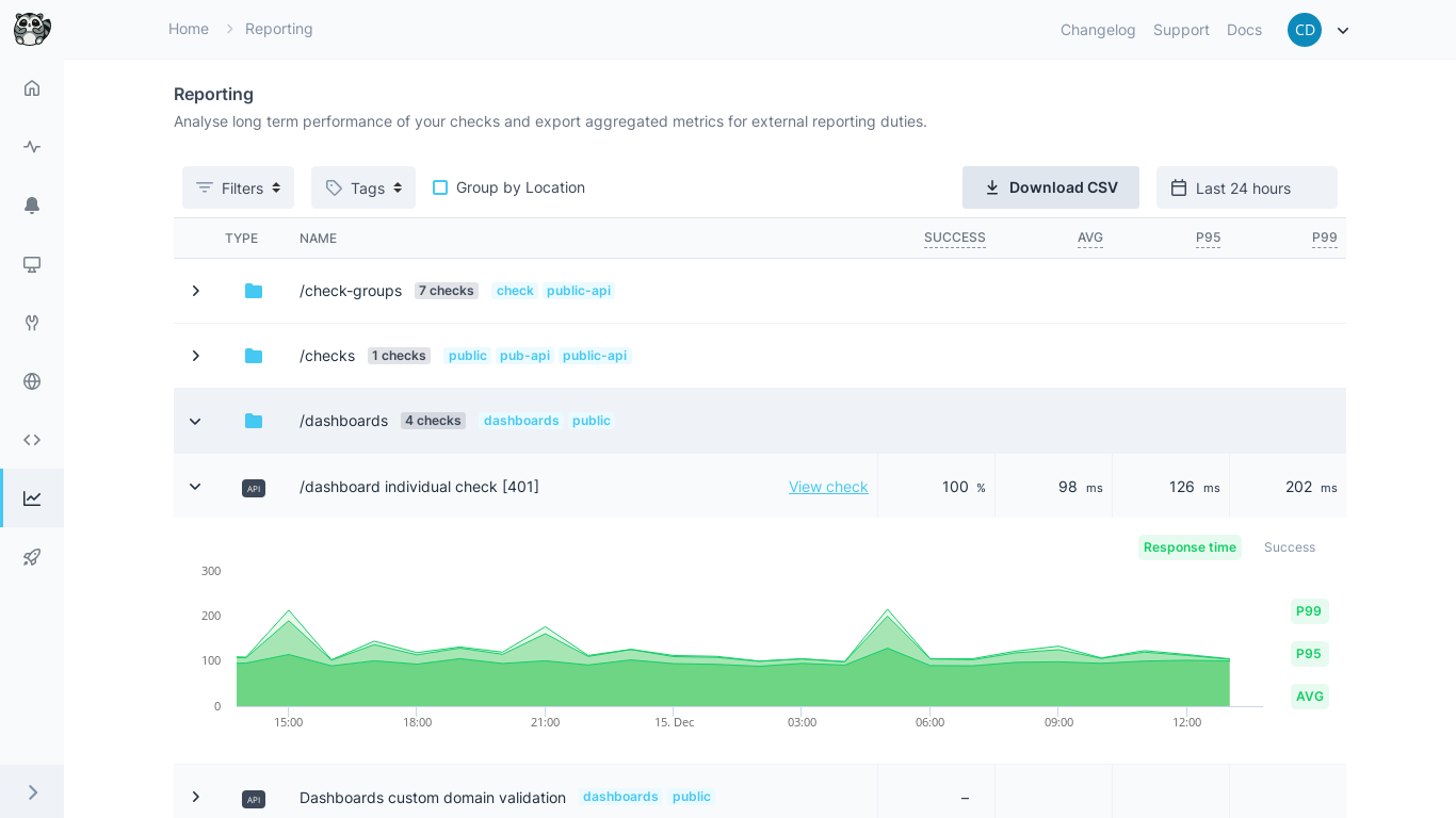
Dashboard overview
The reporting dashboard lists your checks, 25 per page, with key performance metrics at a glance. Avg, P95 and P99 count only runs with a measured response time. A check without measured runs shows a dash. Use this view to:- Quickly identify underperforming checks
- Monitor trends across your monitoring infrastructure
- Compare performance between different check types
- Spot patterns in success ratios and response times
Filtering and Sorting
Customize your view using the toolbar filters and sorting options:Date Range
Date Range
Select the time period for your analysis: Today, Last hour, Last 3 hours, Last 24 hours, Last 7 days, Last 30 days, or a custom range. The dashboard adjusts data granularity automatically based on your selection.
Check Filters
Check Filters
Type a filter into the search bar, for example
tags:is:prod. You can filter by status, check type, tags, project, location, creator, name, group, URL, logical ID and whether the check ran, and by the Success, Avg, P95 and P99 metrics, and combine filters with and and or. See Filters for the syntax and what each field matches. You can save any filter as a view.Group by Location
Group by Location
Type
group by location in the filter field and press Enter to list one row per check and location. See Group the rows.Sorting Options
Sorting Options
Click a column header to sort by Type, Name, Success, Avg, P95 or P99, in ascending or descending order. When you group by location, you can also sort by Location. Checks without a value come last.
Performance Graphs
Use the Table and Chart toggle in the toolbar to switch between the list and a chart of response times and success ratios over your selected time period. Select up to 12 checks in the table and click Compare in chart to chart them together. Without a selection, the chart shows the first 12 checks in the table’s order, the 12 with the highest P95 unless you sorted the table.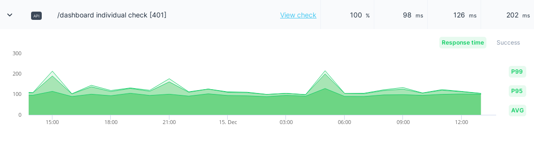
Graph Features
Response Time Metrics: Toggle Avg, P95 and P99 with the Metrics buttons above the chart. P95 is shown by default. Each check keeps its color across the chart, and Avg and P99 use dotted and dashed lines. Success Ratio: Click Success in the Metrics buttons to add a pane with the percentage of successful check runs over time. Dynamic Granularity: Data grouping adjusts automatically based on your date range:Data Export
Export your monitoring data for external analysis, reporting, or archival purposes.CSV Export Process
1
Select Date Range
Choose the time period for your export using the date range picker.
2
Apply Filters
Use check type, tags, and other filters to narrow your dataset if needed.
3
Download
Click Download CSV in the toolbar of the Table view to generate your export file.
Export Data Fields
The CSV export (checkly_export.csv) includes the following columns:
All statistics are calculated based on your selected date range. The default range is “Last 24 Hours”.
Best Practices
- Regular exports: Use the Reporting API to automate periodic exports for long-term trend analysis
- Filter strategically: Use tags and groups to create focused reports for different teams
- Monitor P95/P99: Don’t rely only on averages - percentiles reveal user experience reality
- Compare periods: Use date range filtering to compare performance before and after deployments